
A skunkworks of design miscellanea.
Well, friends, sometime’s there’s just a glut of visual design that comes to life and you don’t know how to categorize it other than designing for fun. Here, in no particular order you’ll find a record of a wide variety of assorted projects—self-initiated puttering, favors for friends, and artful pretensions simply for their own sake.
Shape, form, & color.
Look, I’ll be honest with you. I’m an absolute sucker for geometry, primary colors, and texture. Mix those ingredients up, and it’s hard to not eventually land on something delicious. There’s something poignant in abstraction—being able to derive joy from visual incongruity. Try it out sometime! Grab a couple of crayons, layer some shapes, and give yourself permission to just have some fun. You’re worth it, friends.


A muse, Honest Abe.
Designers are a weird bunch, right? Well, I’ll do my part: when I feel like I need to noodle on a new idea, or a new technique to try out, I turn to…Abraham Lincoln. Your guess is as good as mine. Maybe it’s his unique visage. Maybe it’s the mystery of his place in the pantheon of American history. Perhaps it’s that nobody wears a good stovepipe hat anymore. Whatever the reason may be, Honest Abe pops up in my experiments more than coincidence would account for.


Pigeonhole, a bitmap typeface.
I’m in awe of type designers—it’s a discipline whose intricacies are nearly unfathomable to me. That said, it’s always a blast to take a crack at designing a few letterforms or, heck, a full-fledged alphabet. During Thanksgiving break a few years back, I set some restraints and went about the puzzle of trying to build a full, bitmap-inspired collection of letterforms. The result? Pigeonhole!


Biden Bold.
Oh, goodness, my buddy Aaron Draplin is a design whirlwind in the best sort of way—you know ‘em, you know his work, and you love ‘em both. Well, the DDC has recently got into the type game (first with the industrial DDC Hardware family) and the results are just what good typefaces should be: eye-catching, utilitarian, and possessing a standout personality. Aaron’s recent release—the presidentially-named BIDEN BOLD—is honest as they come. It’s earnest. It speaks plainly, not in order to obfuscate or misdirect, but to be eminently and honestly approachable. Draplin graciously let me take the typeface for a spin, and it was a joy to use. Check it out, pals!


Simple (awesome) bits of type from SimpleBits.
There’s a kind of magic that graphic designers-turned type designers are able to conjure. Now, I’ve had the pleasure of knowing Dan Cederholm for a handful of years now—both as the co-founder of Dribbble, and as the man behind SimpleBits. These days, Dan’s off on awesome new advenchers, among them designing type, and he’s got that designer-first magic I was talking about. I lucked out and was able to put two SimpleBits type families through their paces—Parkly and Vault Alarm. Be sure to check out all that Dan’s currently up to!


Type as language amplification.
Some people want their type neutral, for it to disappear and be as bland as tap water. Well, for me—I love type that’s loud, that’s vernacular, or that wrenches your heartstrings. It should make you feel something, right? I think so, anyway. Below you’ll find a smattering of designs that lean on type to evoke those emotions—some even incorporating custom letterforms in the mix.


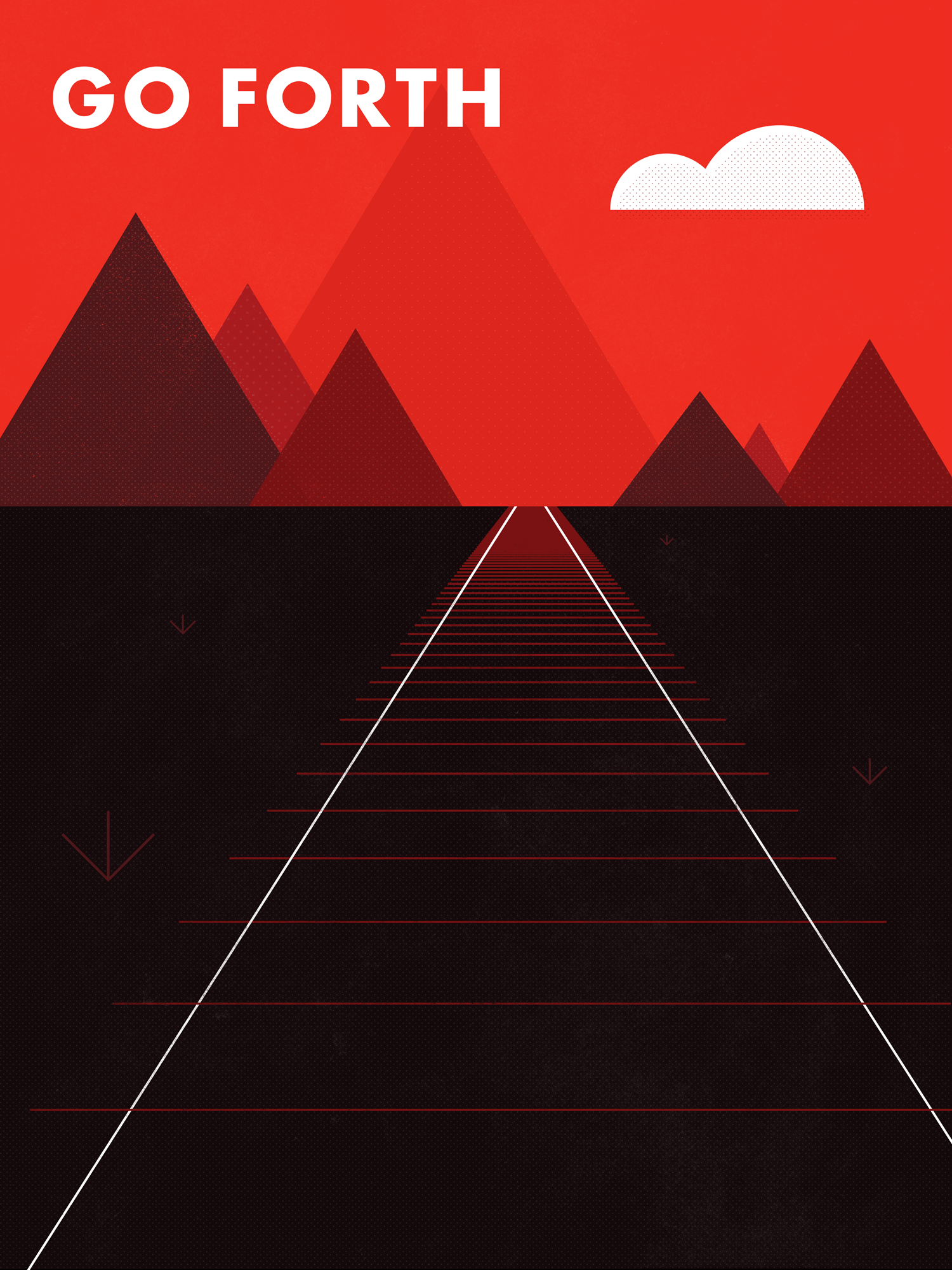
Assorted posters.
Posters are a force. Large. Impactful. Visceral. They’ll stop you in your tracks and make you listen. Below is a collection of poster designs, most created simply for their own sake.


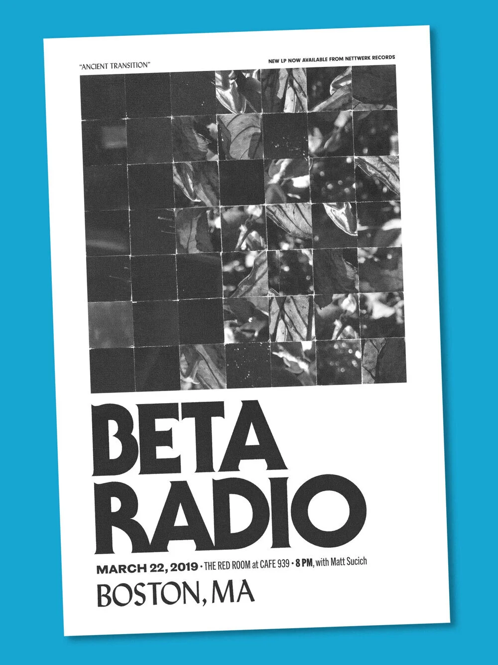
Musical fan art.
Look, I admit it—like hordes of designers before me, I was first drawn into the possibilities of graphic design through a love of record covers. Their canvases were a first meaningful glimpse into the expressive, evocative power of type and image colliding. Cliché? Maybe. But I’m OK with that. A guilty pleasure of mine is cooking up designs for favorite bands and their albums. Fan art!


Green Patriot Posters.
In the latter days of learning design at RISD, I was lucky enough to participate in a class taught by the boundlessly-talented Nancy Skolos. The course teamed up with Green Patriot Posters, an initiative advocating for climate change intervention with a similar urgent calls-to-action as seen in the WWII era. In addition to designing posters in support of the campaign, I had the opportunity to be an assistant editor on the project’s first book, Green Patriot Posters: Images for a New Activism, published by Metropolis Books.


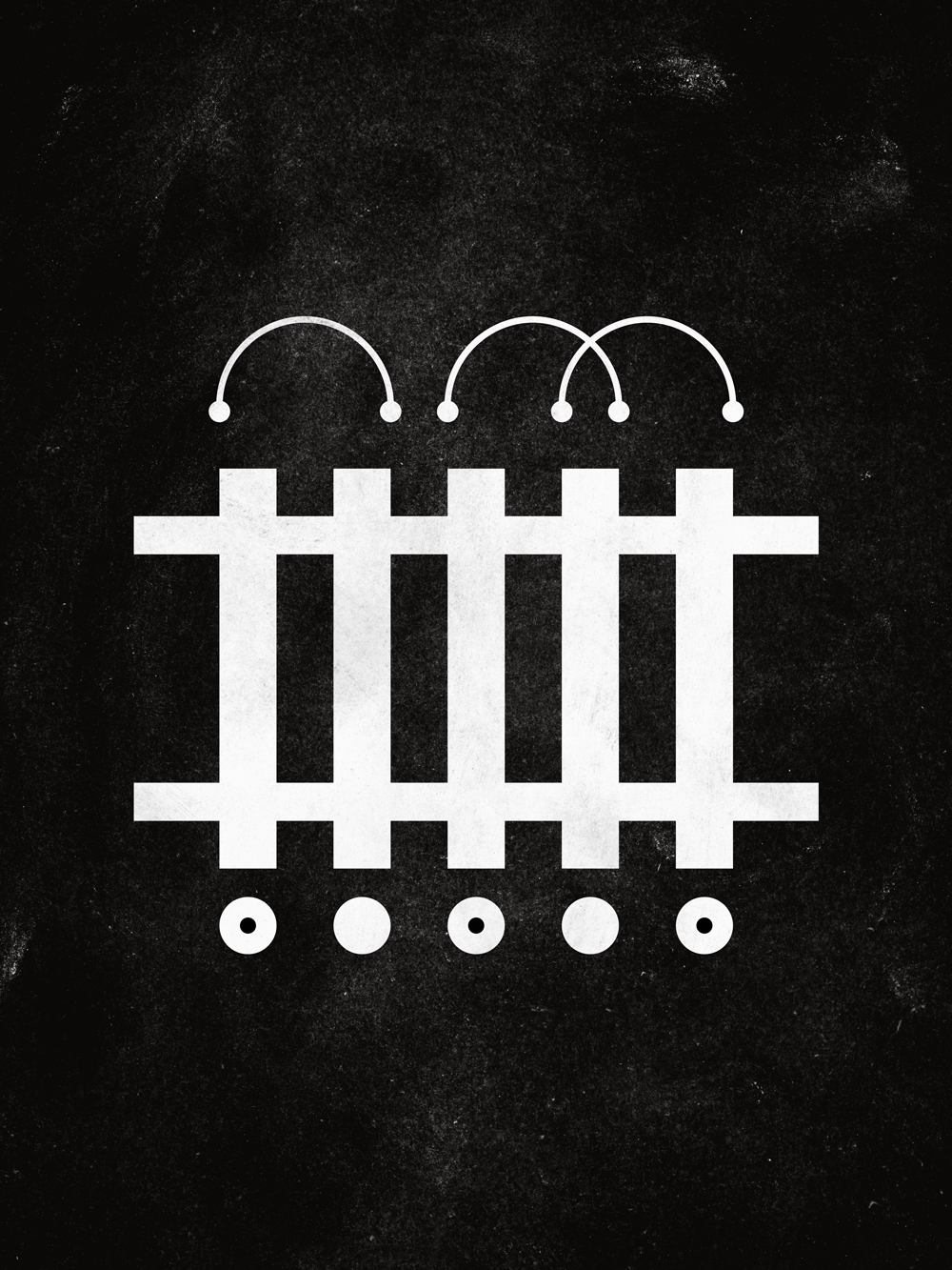
Everything is geometry.
I told you above that I’m a sucker for geometry. Again, there’s just something charming about being able to make an abstract arrangement of shapes and lines into a composition that brings joy. I know that sounds axiomatic to just about, you know, most elements of graphic design or modern art. But, hey—it still tickles my fancy.


A hodgepodge of all the rest.


