Pool Tile Sans
As a seasoned typographer, I’ll be honest—the discipline of type design might as well be sorcery. So many moving parts. Display typefaces, however, are a bit more forgiving in their character sets and necessary polish. Thought it was about time to give it a try…


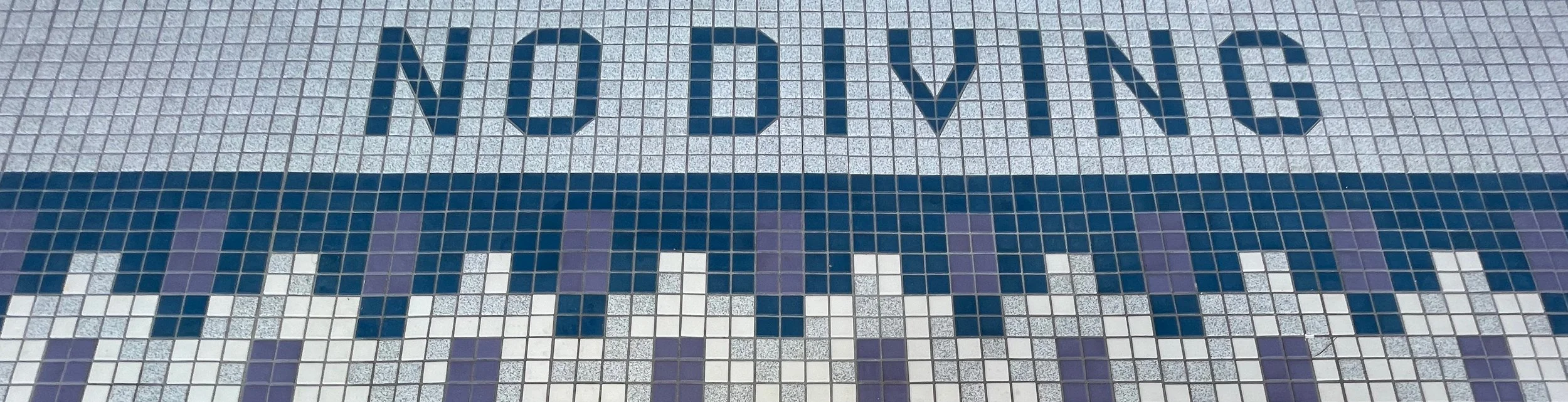
Built from a (seemingly) simple kit of parts.
The idea for the Pool Tile Sans design was based upon modular letterforms built out of tile that surrounds a public pool. There’s something charmingly utilitarian about the forms; the message is infinitely more important than the aesthetics. No Diving. Shallow. Depth 4 ft-0 in.
The optical adjustments and nuances of certain letterforms turned this exercise into a larger-than-expected effort. That aside, it was an enjoyable puzzle to solve; an enlightening first foray into crafting a display typeface. The design features uppercase, lowercase, diacritics, catchwords, and ornaments.