vernacular circles
archiving the wonder of everyday design history
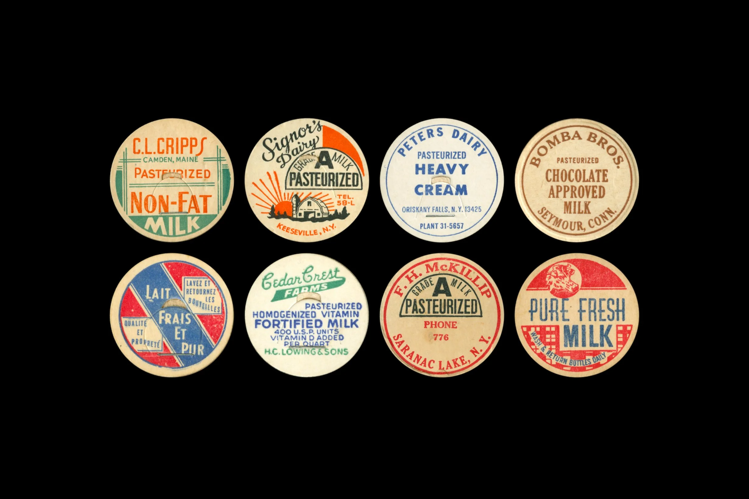
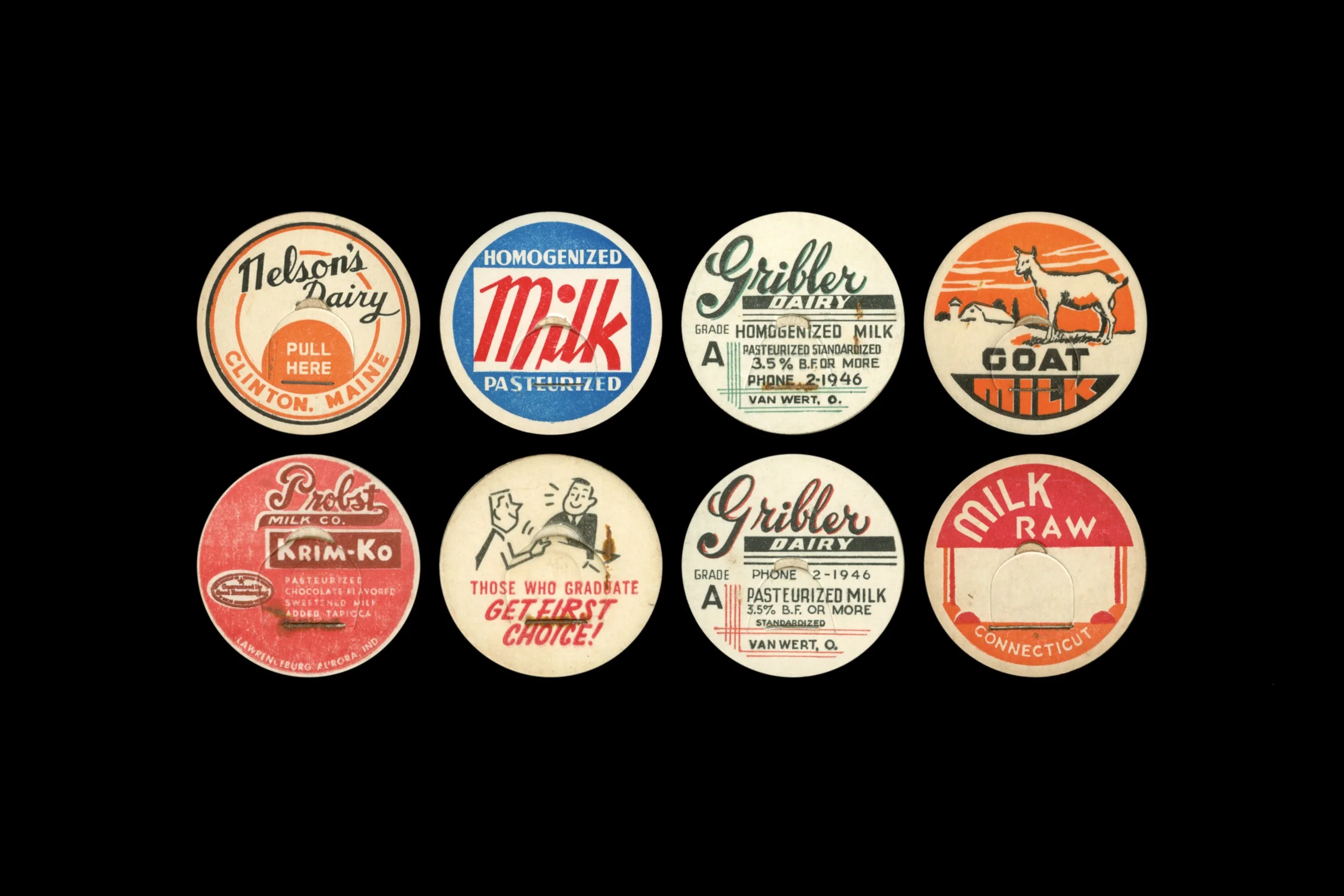
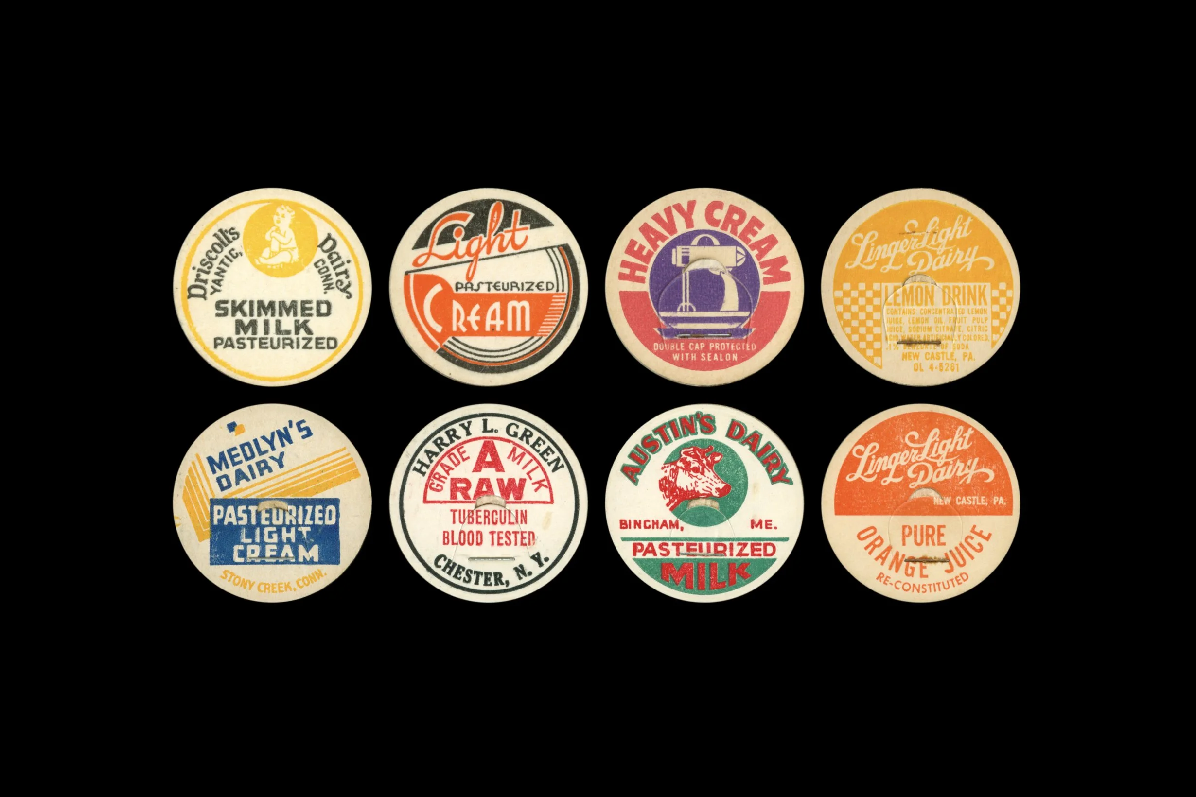
Vernacular Circles is a visual survey celebrating an honest, hardworking gem of commercial art—the common milk cap. Once a ubiquitous part of everyday life, why preserve them now? Aside from the nostalgia they may evoke, mid-century milk caps are artifacts of nimbly-executed graphic design. Read more about the project’s history below, or view the entire archive.
| Designer Midnight Umbrella |
| Project Form Archive + Website |
| Client Personal |
| Dimensions N/A |
| Year 2015–Present |
BRIMFIELD BOUND.
hit the road, get ready to haggle, go gangbusters.
Let’s be honest, most designers like to collect things. Books, posters, prints, typefaces—you name it. Sadly, since I have yet to be blessed with a vault of gold bars and/or precious gems, my collectible pursuits skew towards the more affordable side. That’s where Brimfield comes in.
Here in central Massachusetts, it's quite the spectacle when the Brimfield Antique Show comes to town. Three times a year, a small rural town turns into a sprawling encampment of folks hawking vintage wares of every size, shape, and price. If you ever get the chance to go, you should.
That’s where I discovered these aesthetically delightful milk caps—it just so happens that they’re one of the more acquirable, economically responsible things to collect
buiLdling the archive.
collect, scan, crop, edit & build
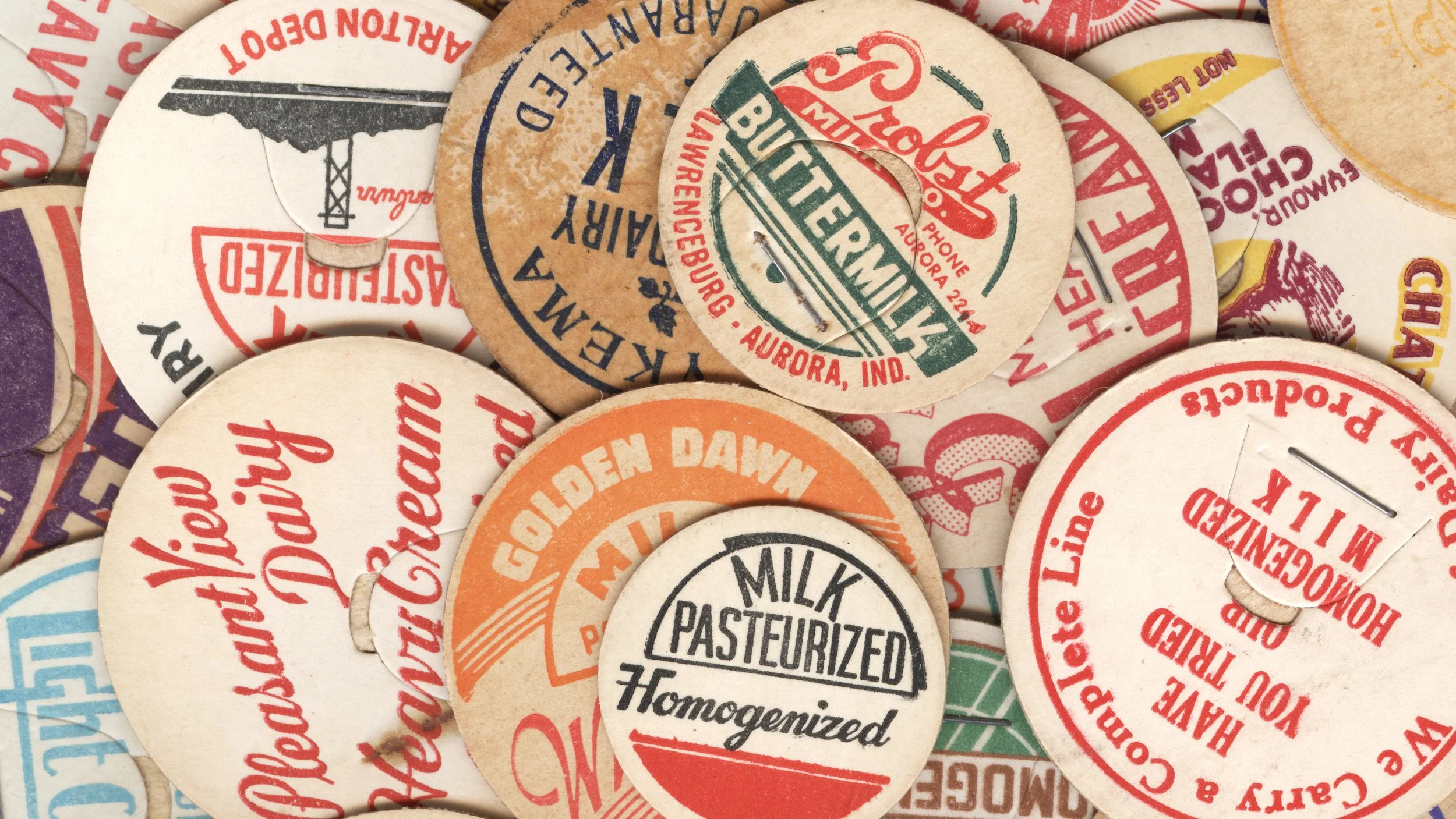
Eventually, the collection outgrew its shoebox. So I scanned every milk cap I had—cropped, cleaned, color-corrected—and built Vernacular Circles as a way to give them a proper home. The result is a browsable archive, part design resource, part design inspiration time machine. Each cap’s a snapshot of regional commerce, printing quirks, and visual instincts that don’t get much attention elsewhere. Some are beautifully balanced. Others are hilariously off-kilter. All of them wear their utility on their sleeve, while still remaining striking.
There’s something compelling about this kind of vernacular ephemera—honest design with a job to do. No pretense, no polish. Just a deadline, a budget, and somebody making the most of it. The idea that even the smallest of spotlights is worthy of considered design moves.
If you’re a type maven, a packaging enthusiast, or just someone who appreciates the weird charm of small things, I hope you find something to love here. Vernacular Circles is a little tribute to design grit baked into the everyday.

an economy of form.
moving (graphic) mountains with small moves
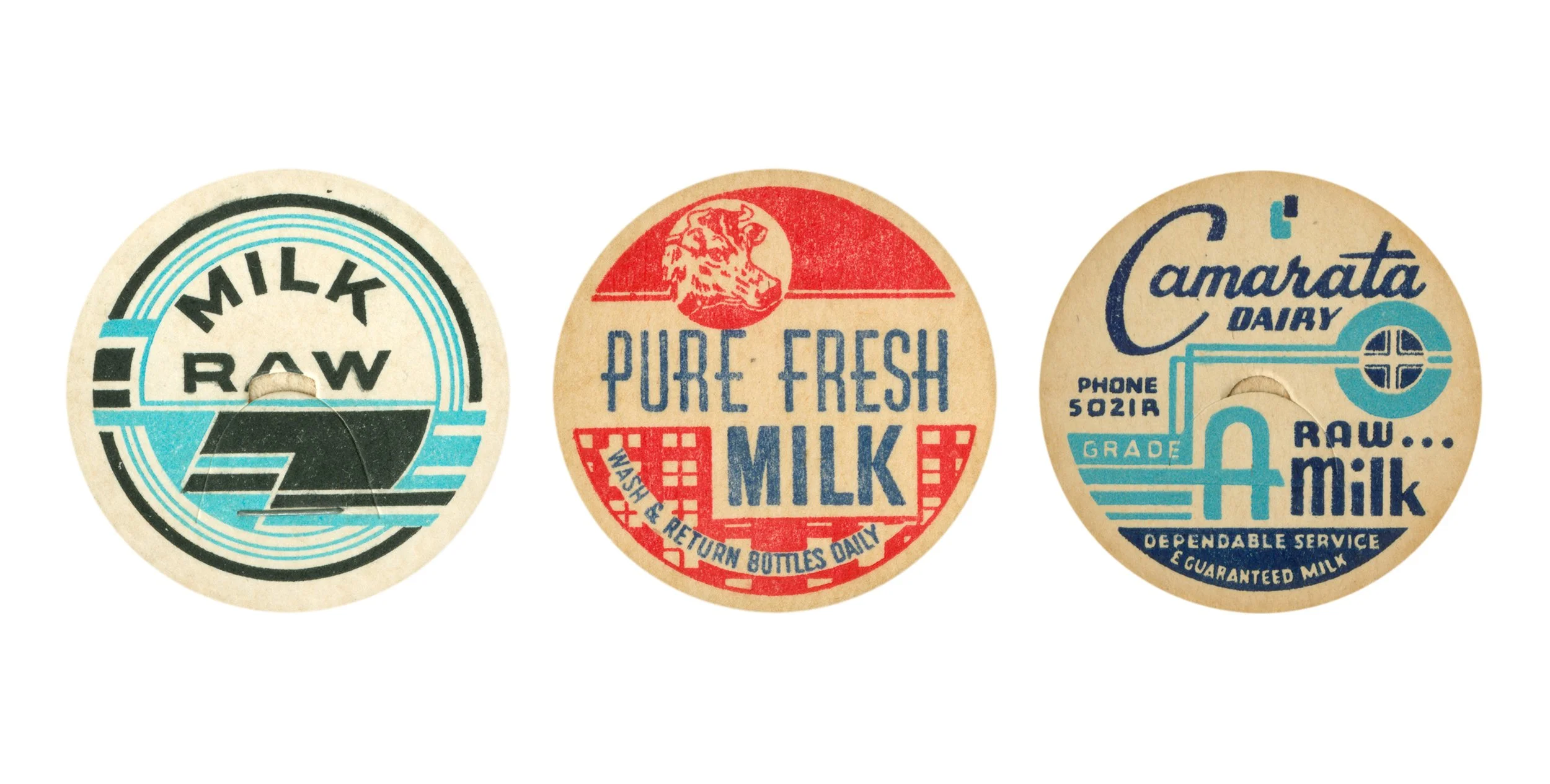
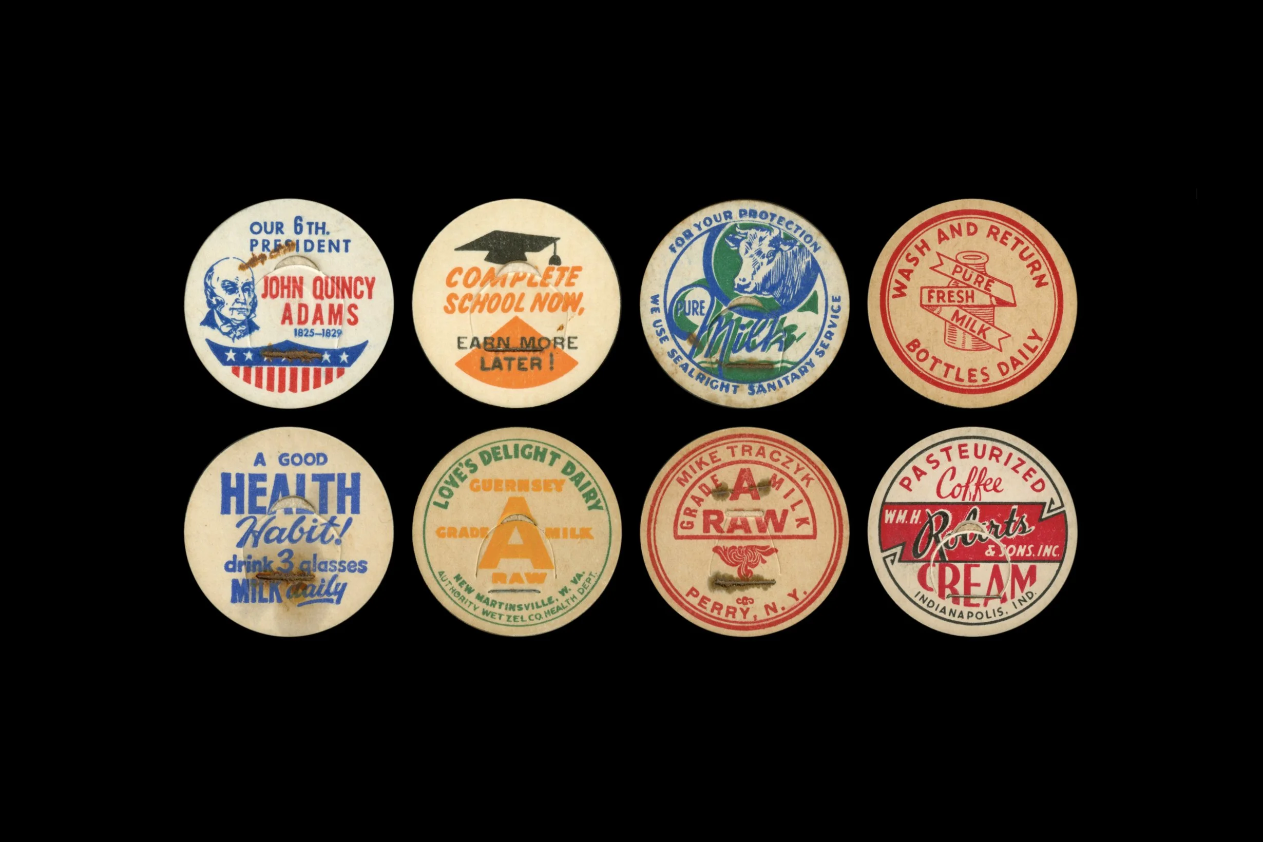
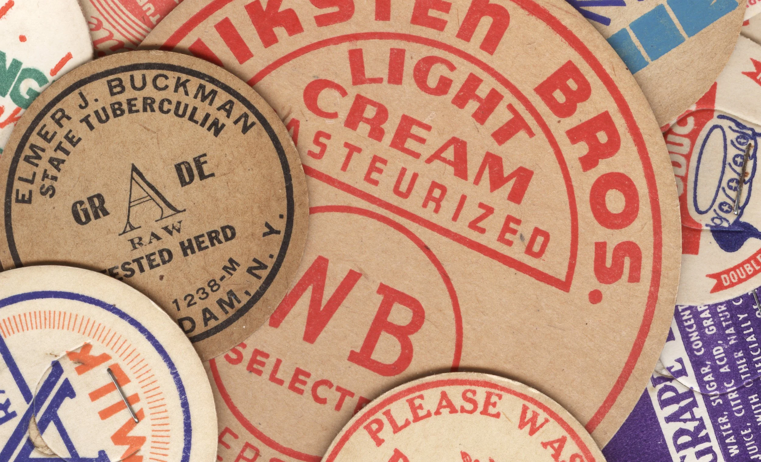
These graphic artifacts are scrappy. They’re efficient. They have limited resources, but they make as big an impact as they can. Despite their restricted canvas size, mid-century milkcaps often possess energetic typography and illustrations—all while relying on an economy of form and color. Most of the examples in the Vernacular Circles archive are one or two color jobs. But that’s more than enough to pack a visual punch.

THOSE TYPEFACES.
a small, powerful typographic palette
A charming facet of mid-century milk caps is that they possess a distinctly buoyant personality. Employing deft combinations of multiple typefaces and typographic styles in their design helps reinforce their slightly madcap visual voice.
What’s also striking is that these pieces of ephemeral design feature production techniques—type on a curve, overprinting, custom lettering—whose labor investment is easy to underestimate, especially in comparison to the convenience our contemporary tools afford.

Earnest messages.
part advertisement, part encouragement
Perhaps too cynical for our world now, there’s something decidedly earnest about these circles—even if they were simple advertisements. While most caps are emblazoned with their corresponding dairy’s branding—or proudly hawk the health benefits of drinking milk—there’s something hopeful about their demeanor. They mean well.
If anything, these mid-century milk caps provided a diminutive canvas for small typographic gestures that offer up kind or helpful words into the ether.


these vernacular circles show how much one can do with a limited canvas size and minimal color palette.
Check out the complete archive at:
vernacularcircles.com