POOL TILE SANS
DIPPING TOES INTO THE DISCIPLINE oF TYPE DESIGN
As a seasoned typographer, I’ll be honest—the discipline of type design might as well be sorcery. Pure magic. So many moving parts. Display typefaces, however, are a bit more forgiving in their character sets and necessary polish. Thought it was about time to give it a try…
| Designer Midnight Umbrella |
| Project Form Typeface + Specimens |
| Client Personal |
| Dimensions N/A |
| Year 2021 |

BUILT FROM A (SEEMINGLY) SIMPLE KIT OF PARTS.
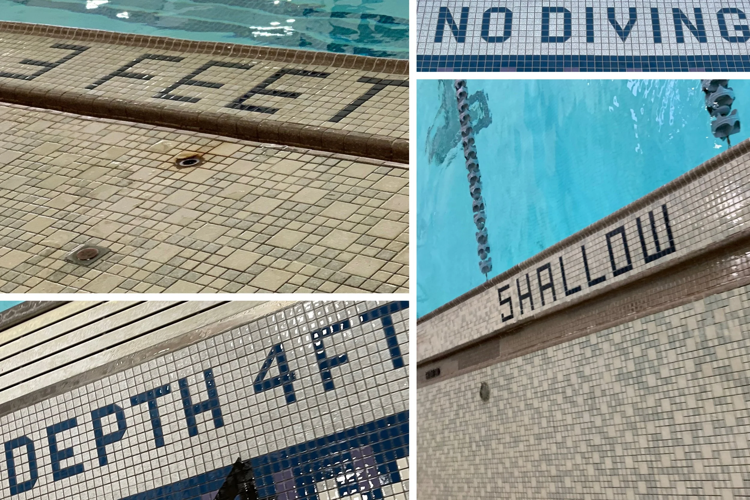
You can almost smell the chlorine
The idea for the Pool Tile Sans design was based upon modular letterforms built out of tile that surrounds a public pool. There’s something charmingly utilitarian about the forms; the message is infinitely more important than the aesthetics:
No Diving. Shallow. Depth 4 ft-0 in.
The optical adjustments and nuances of certain letterforms turned this exercise into a larger-than-expected effort. That aside, it was an enjoyable puzzle to solve; an enlightening first foray into crafting a display typeface. The design features uppercase, lowercase, diacritics, catchwords, and ornaments.