Bob dylan’s New York
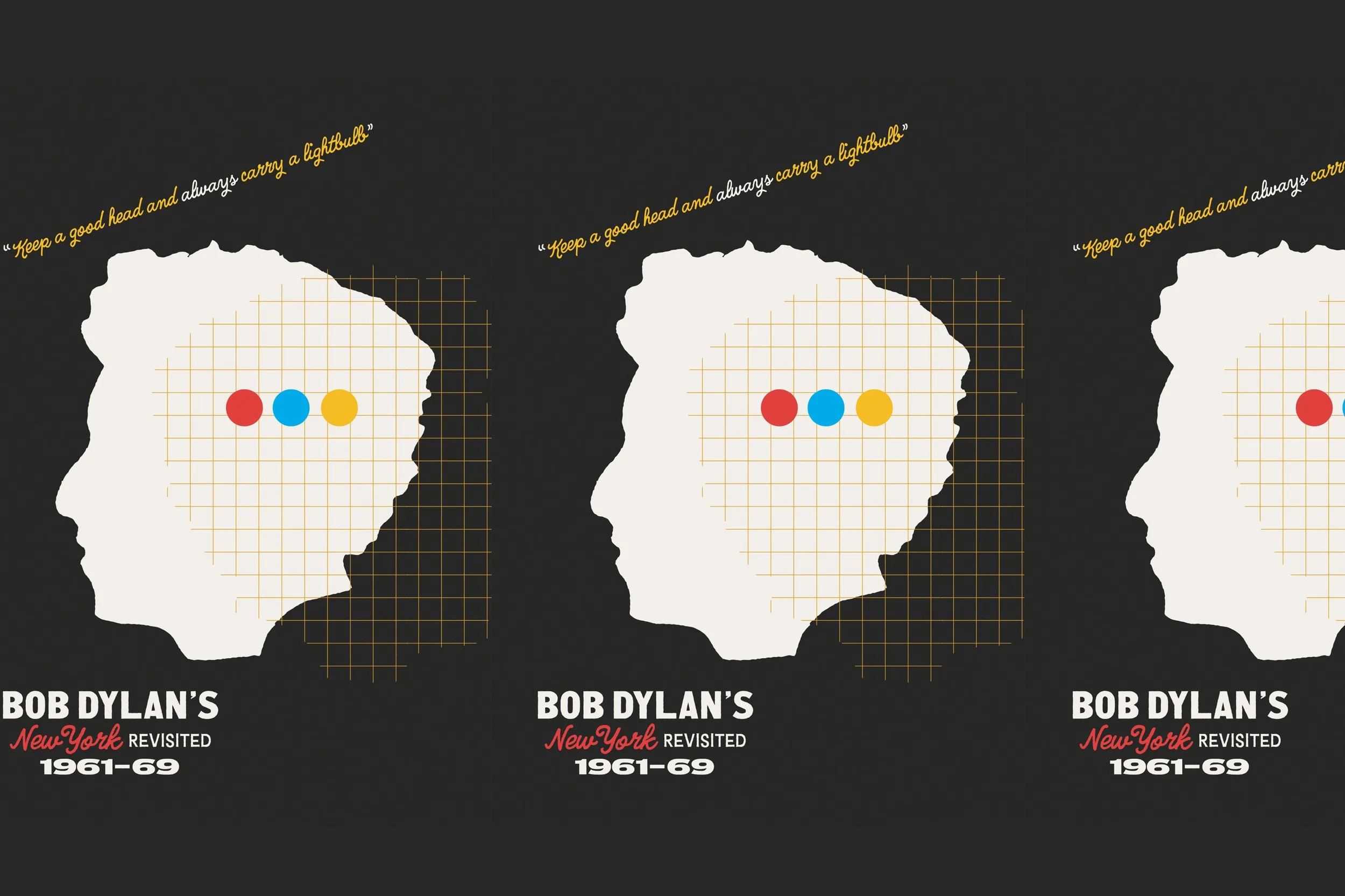
keep a good head, and always carry a lightbulb
What a thrill to get the call from the lovely folks at Herb Lester Associates—the premier purveyors of beautifully illustrated culture & travel guides. They were retracing the steps of Bob Dylan’s career in the 1960s with a brand-new guide, and wanted us to lead the charge.
Bringing my BSDS compatriot Erik Weikert in to tag-team the project, I’m pleased as punch with the final results. And, hey— pick up your own copy at Herb Lester!
| Designer Midnight Umbrella + Erik Weikert |
| Project Form Poster, Postcards + Packaging |
| Client Herb Lester Associates |
| Dimensions 400 x 690mm, 100 x 138mm |
| Process Offset Lithography |
| Year 2019 |
EPHEMERA APLENTY.
A cornucopia of historical ARTIFACTS
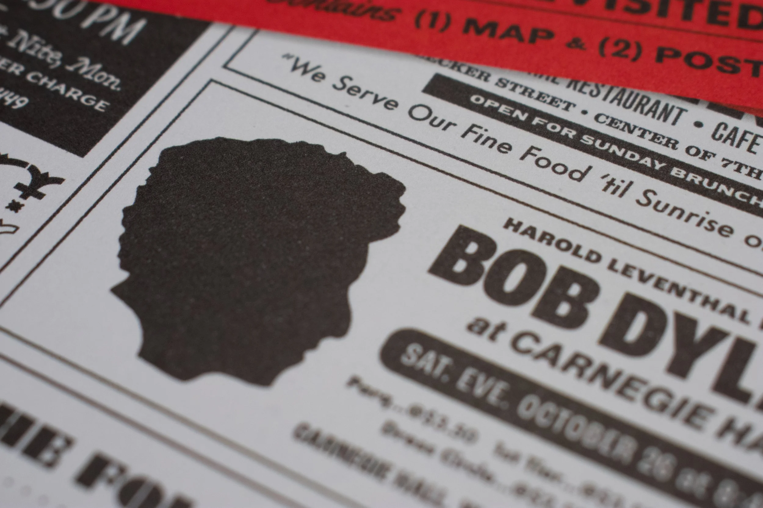
One of the most exciting facets of this project was being able to use authentic 1960s era ephemera as a jumping-off point. Trawling through old advertisements from issues of The Village Voice was a blast, and the search revealed a splendid array of expressive typography to riff on. Joining the assortment of quirky type to be inspired by was a litany of lo-fi hand lettering—a representation of the by-necessity and by-design DIY aesthetic the scene represented.
mapping dylan’s Journey.
Here. there. everywhere. And greenwich village.
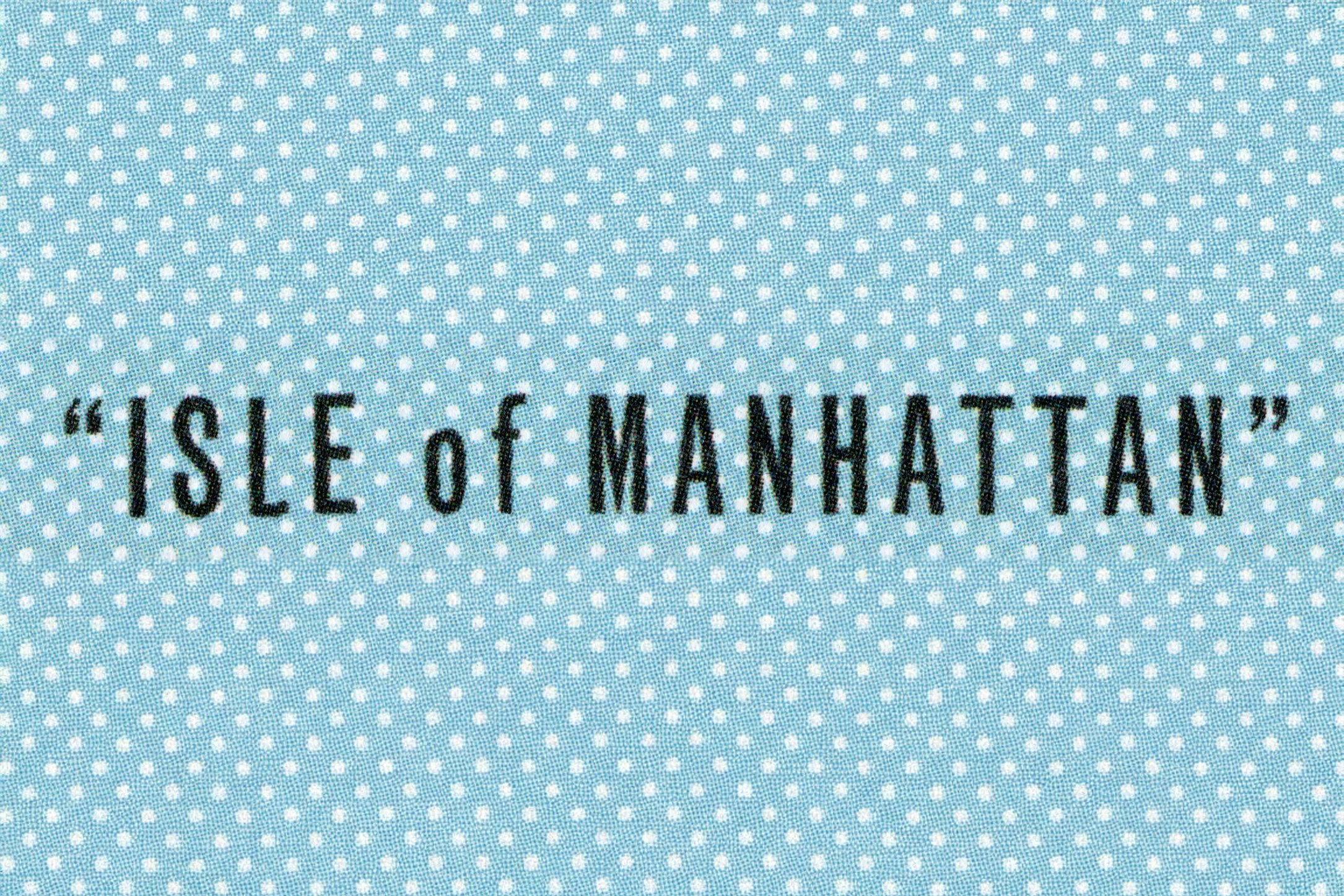
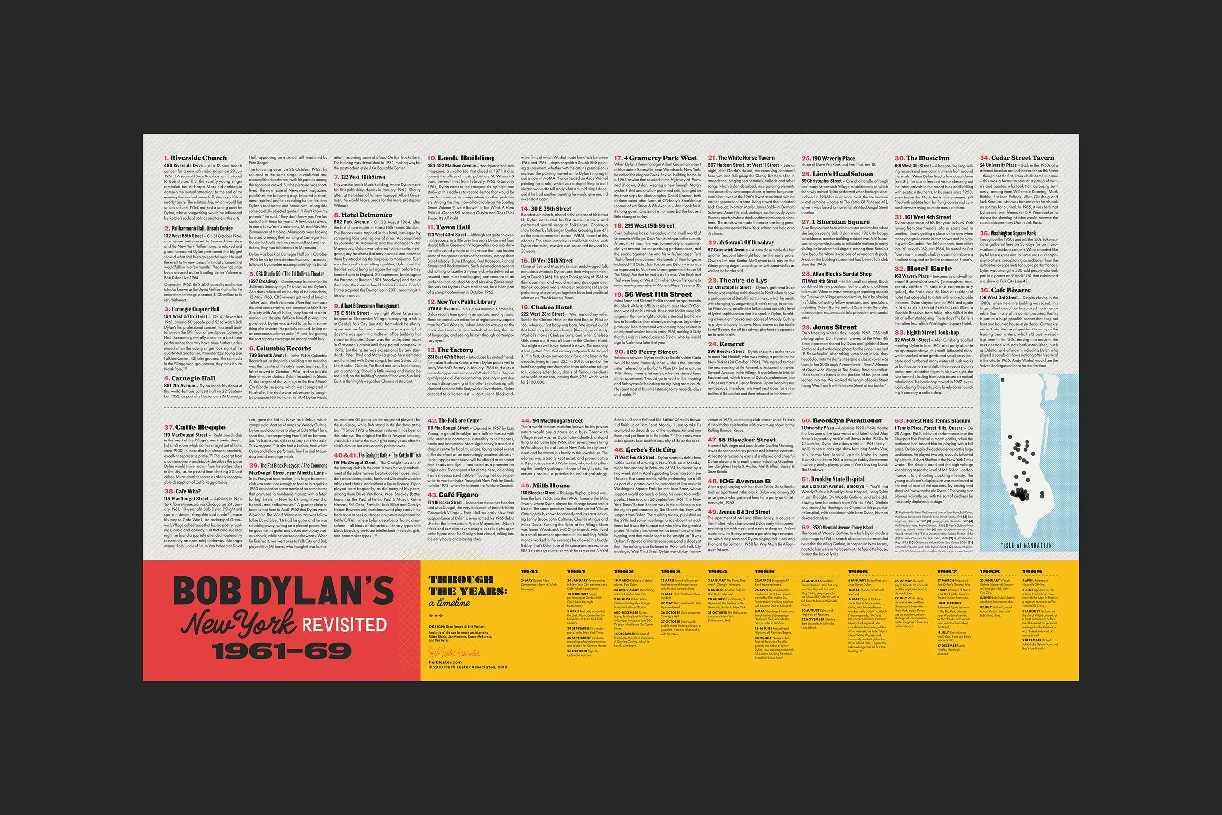
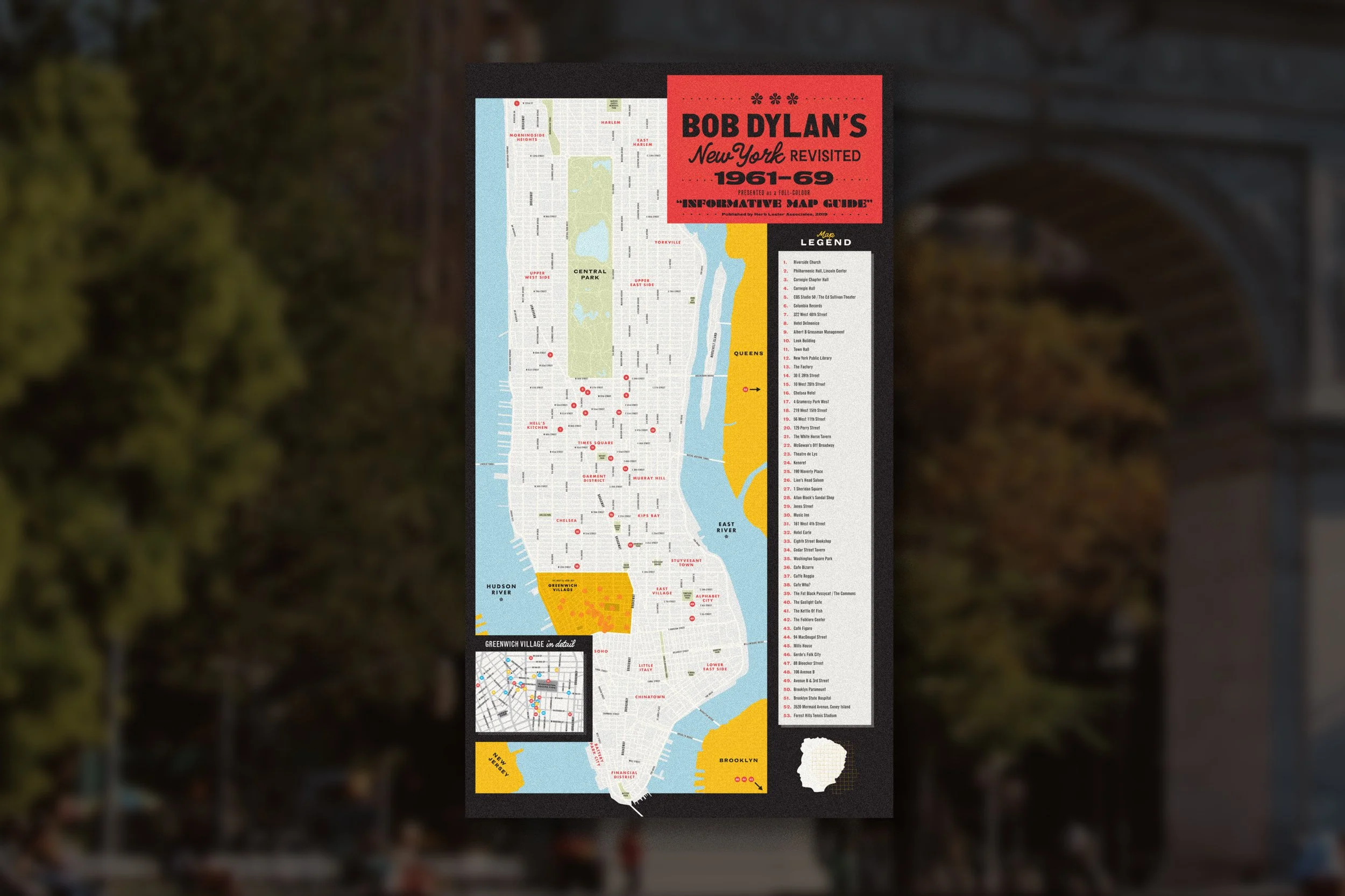
The format of the unfolded guide, coming in at 400 × 690mm, provided space to profile most of the isle of Manhattan.
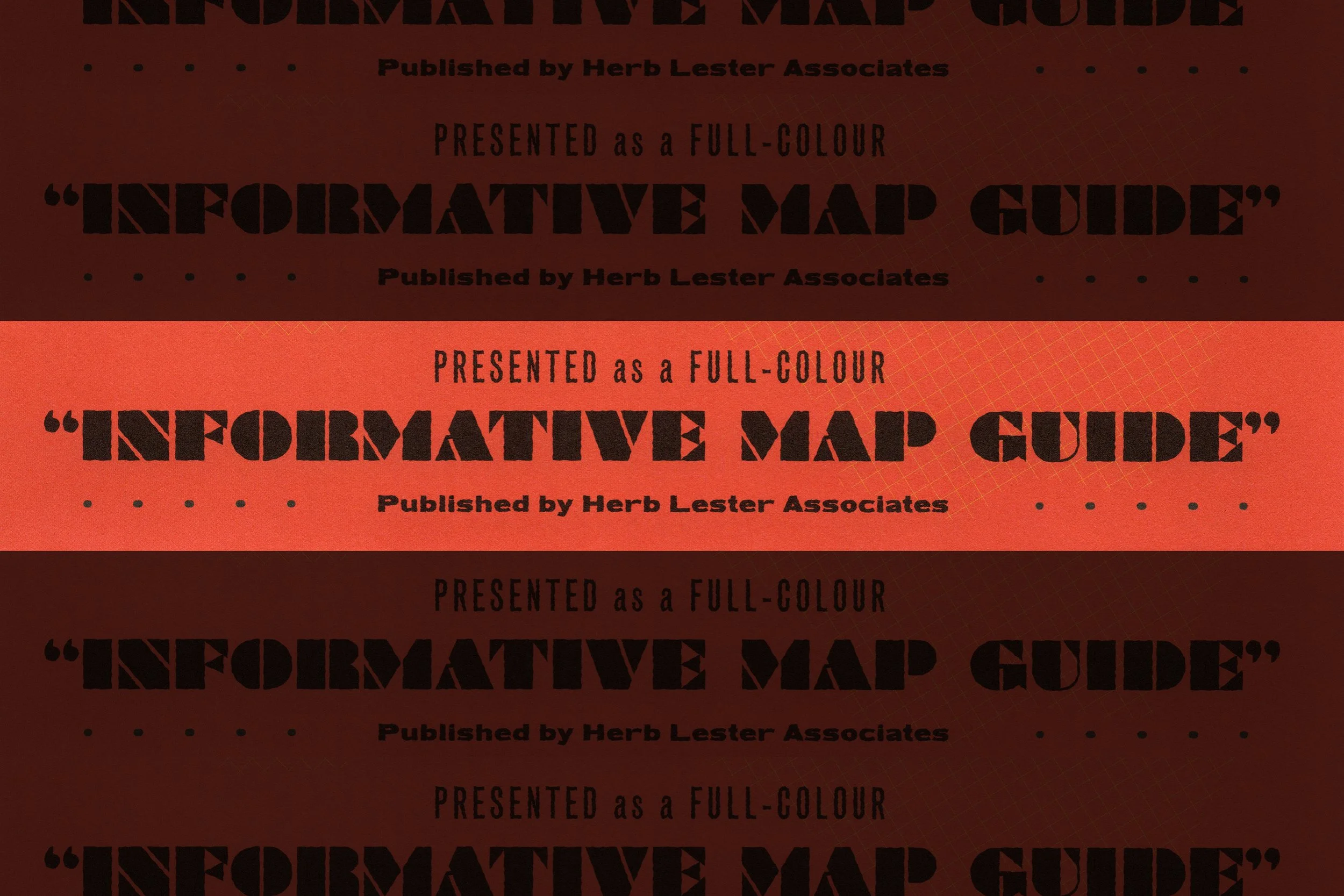
The map’s cartouche features a melange of typographic styles—from ill-proportioned (but spirited) grotesks—to scruffy hand-lettering, workhorse gothic designs. Again, this was meant to reinforce the DIY ethos of the ’60s folk scene. It’s scrappy. It’s function via any necessary form. Also, between you and me, I’m up for any excuse to use Braggadocio in a project. The remainder of the map (street names and neighborhoods) relied on the tried-and-true sturdiness of Futura and Trade Gothic Next.
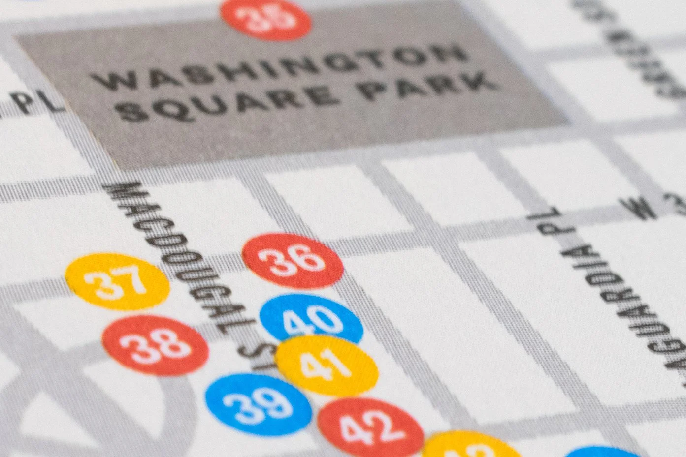
The map also features a densely populated inset of Greenwich Village, where the musician spent time during his career’s formative years.

MAKING MESSAGES.
Aside from the chock-full map, Bob Dylan's New York Revisited 1961-69 also features two accompanying postcards, with the messages Get Lost and Get Found. In order to make ’em feel connected to the source material, I ended up extracting and recreating the hand-drawn letterforms from the cue-card laden video for Dylan’s Subterranean Homesick Blues.
